Page View vs. Time Plot Visualizer
- Summary: A FreeCodeCamp challenge for a Python app that parses a CSV file and visualize the data as a bar plot, box plot, and line plot using Maplotlib and Seaborn.
- Source URL: https://replit.com/@michellemtchai/page-view-time-series-visualizer
- Stacks:
Objective
Complete a Python assignment and passes all the tests provided by FreeCodeCamp
Original Challenge: https://www.freecodecamp.org/learn/data-analysis-with-python/data-analysis-with-python-projects/sea-level-predictor
Assignment
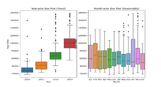
For this project you will visualize time series data using a line chart, bar chart, and box plots. You will use Pandas, Matplotlib, and Seaborn to visualize a dataset containing the number of page views each day on the freeCodeCamp.org forum from 2016-05-09 to 2019-12-03. The data visualizations will help you understand the patterns in visits and identify yearly and monthly growth.
Use the data to complete the following tasks:
- Use Pandas to import the data from
fcc-forum-pageviews.csv. Set the index to thedatecolumn. - Clean the data by filtering out days when the page views were in the top 2.5% of the dataset or bottom 2.5% of the dataset.
- Create a
draw_line_plotfunction that uses Matplotlib to draw a line chart similar toexamples/Figure_1.png. The title should beDaily freeCodeCamp Forum Page Views 5/2016-12/2019. The label on the x axis should beDateand the label on the y axis should bePage Views. - Create a
draw_bar_plotfunction that draws a bar chart similar toexamples/Figure_2.png. It should show average daily page views for each month grouped by year. The legend should show month labels and have a title ofMonths. On the chart, the label on the x axis should beYearsand the label on the y axis should beAverage Page Views. - Create a
draw_box_plotfunction that uses Searborn to draw two adjacent box plots similar toexamples/Figure_3.png. These box plots should show how the values are distributed within a given year or month and how it compares over time. The title of the first chart should beYear-wise Box Plot (Trend)and the title of the second chart should beMonth-wise Box Plot (Seasonality). Make sure the month labels on bottom start atJanand the x and x axis are labeled correctly.


