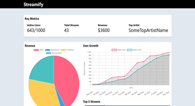
Streamify Dashboard
- Summary: A challenge to build a dashboard to present key metrics and data visualizations, allowing the service's management team to gain insights into user activity, revenue, and content performance.
- Source URL: https://github.com/michellemtchai/streamify-dashboard
- Demo URL: https://streamify-dashboard-michellemtchai.netlify.app/
- Stacks:
Objective
Create a frontend application that displays an analytics dashboard for a fictional music streaming service called "Streamify." The dashboard should present key metrics and data visualizations, allowing the service's management team to gain insights into user activity, revenue, and content performance. The goal is to build a functional and visually appealing dashboard that is both responsive and user-friendly.
Assignment
- The project must include the following:
- Key Metrics
- Data Visualization
- Data Table
- Key Metrics display cards that shows the following:
- Total Users: The total number of registered users on the platform
- Active Users: The number of users who have streamed at least one song in the last 30 days.
- Total Streams: The total number of song streams on the platform.
- Revenue: The total revenue generated from subscriptions and advertisements.
- Top Artist: The artist with the most streams in the past 30 days.
- Data Visualization includes the following charts:
- User Growth Chart: A line chart that shows the growth in the number of total users and active users over the past 12 months.
- Revenue Distribution: A pie chart that shows the breakdown of revenue from different sources (e.g., Subscriptions, Ads).
- Top 5 Streamed Songs: A bar chart that displays the top 5 most-streamed songs over the past 30 days.
- Data Table lists detailed information about recent streams with the following columns:
- Song Name
- Artist
- Date Streamed
- Stream Count
- User ID
- Implement sorting and filtering functionalities for the data table, allowing users to sort by date or stream count, and filter by artist or song name.
- Allow users to interact with the charts. For example, users should be able to hover over points on the line chart to see exact numbers or click on a segment of the pie chart to filter the data table by that revenue source.
- The dashboard should be responsive and visually appealing, adapting to various screen sizes.
- Follow a modern design language with a focus on usability and clarity.
- Use a CSS framework like Tailwind, Bootstrap, or a custom solution that you prefer.
- Use React to build the application
- Handle state management using React's Context API, Redux, or any other state management solution you're comfortable with.
- Data can be hardcoded or mocked using a tool like JSON Server, MirageJS, or similar. You do not need to connect to a real backend or database; feel free to generate realistic mock data to populate the dashboard.
- Optimize the application for fast loading times and minimal re-renders.
- Consider using techniques like lazy loading, code splitting, and memoization where appropriate.
- Write unit tests for at least one component using a testing library like Jest or React Testing Library. Include any additional tests you think are important.
Design Choices
I chose to build this project with the suggested stacks of React, Tailwind CSS and Mirage JS. I dockerized this app for ease of spinning up a reproducible development environment.
For additional features, I chose to build a multi-field filtering system. I made it so that the filtering for each column is dependent on the type of data present in the table. There are three types of filtering:
- String filtering
- Date filtering
- Number filtering
For the string filtering, the filtering takes a look at the whether the column string has a substring with the queried value. The query is case-insensitive.
For the date filtering, I chose to create an option-based filtering system. First, the user can choose the type of date filtering they prefer. The following are the options:
- On date: filters for the exact same date as the selected date
- Before date: filters for all dates before the selected date
- After date: filters for all dates after the selected date
- Between dates: filters for all dates between the selected start and end.
Lastly, for the number filter, I chose to create a dual slider so that the user can choose a range to filter for column.
This filtering system uses check boxes to decide which column values to apply the filters.
Furthermore, I chose to add optimization via lazy loading and code splitting. The app also has a fallback for when server connection fails. You can see the result of the fallback by running the app locally and changing the resourceUrls in the file src/utils/constants.js. Overwriting one of the urls with an invalid one will trigger the server error view on the dashboard.


